Bar Graphs: Introduction
Overview:
| Topic Included: | Formulas, Definitions & Exmaples. |
| Main Topic: | Data Interpretation. |
| Data Interpretation Sub-topic: | Bar Graph Notes & Questions. |
| Questions for practice: | 50 Questions & Answers with Solutions. |
What is a Bar Graph:
A bar graph is a chart or a graphical representation that shows some data in the form of rectangular bars. A bar graph could be used for representing financial data, geographical data, or any other data to analyze and calculate the required value. A bar graph could be vertical or horizontal.
Types of Bar Graph:
We can divide the bar graph into two categories.
(1). Simple Bar Graph:
When only one set of data in the form of bars represented, then we can call it a simple bar graph.
(2). Multiple Bar Graph:
When multiple sets of data in the form of bars represented on a single bar graph, then we can call it a multiple bar graph.
Bar Graph Examples:
Example(1): The balance sheet of a company is given below in the form of a simple bar graph.
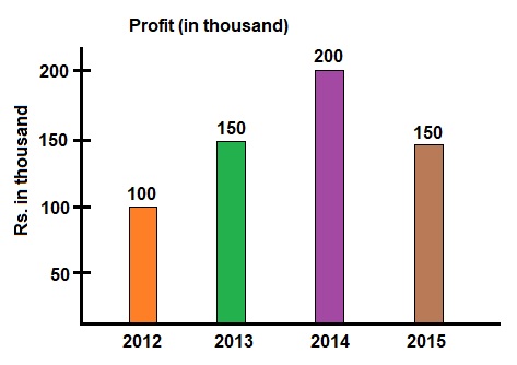
(a): Average profit from 2012 to 2015. $$ = \frac{100 + 150 + 200 + 150}{4} $$ $$ = \frac{600}{4} = 150 \ Thousand $$
(b:) Annual average growth rate. $$ = \frac{150 - 100}{100} \times \frac{100}{3} $$ $$ = 16.66 \ \% \ Per Year $$
(c): Annual growth rate from 2012 to 2015.
Growth rate during 2012 to 2013. $$ = \frac{150 - 100}{100} \times 100 $$ $$ = 50 \ \% $$
Growth rate during 2013 to 2014. $$ = \frac{200 - 150}{150} \times 100 $$ $$ = 33.3 \ \% $$
Growth rate during 2014 to 2015. $$ = \frac{150 - 200}{200} \times 100 $$ $$ = -25 \ \% $$
Example(2): The balance sheet of company A and Company B is given below in the form of a multiple bar graph.
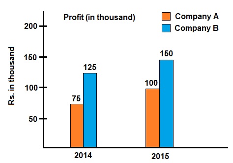
Growth rates of companies A and B in percentage during the years 2014 to 2015.
Growth rate of company A. $$ = \frac{100 - 75}{75} \times 100 $$ $$ = 33.3 \ \% $$
Growth rate of company B. $$ = \frac{150 - 125}{125} \times 100 $$ $$ = 20 \ \% $$
Average profit of companies A and B during the years 2014 to 2015.
Average profit of company A. $$ = \frac{75 + 100}{2} $$ $$ = 87.5 \ Thousand $$
Average profit of company B. $$ = \frac{125 + 150}{2} $$ $$ = 137.5 \ Thousand $$